
UI/UX Design Principles For High-Converting Digital Products
Digital products of today compete with each other in an environment that requires users to make instant decisions. Slow interfaces, unclear navigation or a weak layout may reduce conversions, even if the product is of high value. Strong ui/ux Design is no longer a luxury but a necessity for businesses.
It is more than just appearance.
Good design directly impacts:
Engaged in a variety of ways
Retention
Trust in users
Conversion Rates
Customer satisfaction
Users today expect digital experiences that are intuitive, fast and emotional. The quality of user experience is a key factor in business performance, whether it's a mobile app, SaaS, ecommerce platform or dashboard for enterprise.
It is a fact that users are not loyal to interfaces they find frustrating.
It is my opinion that many businesses mistakenly believe they are having a problem with marketing when in fact they're experiencing a problem with poor customer experience.
The best UI/UX design strategy combines psychology, usability and accessibility with visual clarity in order to create interfaces which guide users towards action.
Understanding user behavior and UX psychology
Understanding user behavior can be a key foundation for successful ui/ux designs.
The users do not always interact with the products in a logical manner. Most decisions are emotional or habitual. They may also be influenced cognitively by shortcuts. UX designers should study how people think, process information and make decisions.
The following are important UX psychology concepts:
Cognitive Load Reduction
Decision simplicity
Familiar interaction patterns
Visual predictability
Instant feedback systems
Users often give up on tasks when interfaces overwhelm them with options.
Hick's Law, a famous study that shows the increase in decision time when there are more choices. High-converting interfaces are designed to simplify decisions for users, rather than overwhelm them.
Amazon and other companies optimize their interfaces to minimize friction during the purchasing process. Even minor changes to checkout ease can result in significant revenue gains.
Strong UX systems also heavily rely on behavioral analytics:
Heatmaps
Recordings of sessions
Click Tracking
Scroll Behavior Analysis
This information helps teams to understand the actual interactions of users with their products, rather than making assumptions.
Strong opinion: Decisions based solely on preferences are often unsuccessful because users act differently from what designers anticipate.
Visual hierarchy and user attention in UI Design
The Strong visual hierarchy allows users to process information more quickly.
The user does not scan the interface line-by-line. Instead, they scan pages looking for:
Important actions
Headlines
Navigation cues
Information about Key
The visual hierarchy determines what the user notices first.
The following is how this can be achieved:
Size contrast
Typescaling
Color emphasis
Space systems
Positioning patterns
This is a quick breakdown.
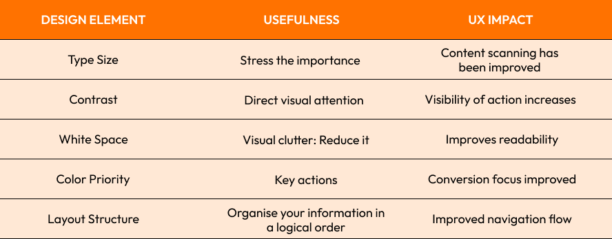
Apple's site is an excellent example of visual hierarchy. It guides the user through its products in a natural way without overloading them with information.
Poor hierarchy creates confusion. Users struggle to know where to concentrate when every element is competing for their attention.
Strong opinion:
When everything appears important, the user does not feel it.

Designing intuitive navigation and user flows
Poor navigation is one of the main reasons why users abandon digital products.
Clear User flows helps users to move from one action or step to the next without any confusion.
A strong navigation system should be:
Reduce friction
Clicks are unnecessary.
Keep interactions predictable
Keep contextual clarity
Effective navigation design often includes:
Breadcrumb systems
Sticky navigation
Menu groupings
Progressive disclosure
Search engine optimization
Spotify's navigation is an excellent example of how to streamline your workflow. The flow of the app is intuitive and predictable, so users can easily navigate through their playlists, settings, and recommendations.
The user flow map is important for product design.
Designers study:
Entry Points
User intent
Paths to task completion
Drop-off Locations
Reduced friction directly increases conversion rates.
Forrester Research published a report that found improving UX can improve conversion rates while decreasing customer support costs.
Your interface should not require users to "figure it out". A good UX is intuitive.
Call-to Action (CTA), Design Strategies that Improve Conversions
It is important to have a strong call-to-action in your digital product.
The CTA directs users to actions like:
Sign up
Purchase
Book a consultation
You can download resources
Start free trials
Many businesses fail to convert customers because of poor CTA placement and unclear messages.
Effective CTA design includes:
Strong visual contrast
Wording that is clear and action-oriented
Placement Strategic
Limited competing distractions
Mobile Responsiveness
Good CTAs reduce hesitation.
The user should understand immediately:
Next steps
What is the importance of action?
How much value do they get?
Netflix's CTA is highly targeted, focusing on minimizing distractions while highlighting immediate value.
CTAs can also benefit from A/B tests:
Button colors
Copying variations
Changes in placement
Page Context
CTAs can be improved to produce revenue increases.
Weak CTAs are silently destroying conversions, as users seldom complain and simply walk away without taking action.

Modern user interfaces are accessible and inclusive.
Modern user interfaces should be accessible to all users, regardless of their physical, cognitive or visual limitations.
It is now mandatory to be accessible. Accessibility improves the usability of products for everyone while also helping them comply with global standards.
Accessibility principles that are important include:
Proper color contrast
Keyboard Navigation
Compatible with screen-readers
Typography that is responsive
Visibility indicators
The design is also more inclusive:
Readability
Navigation Clarity
Mobile usability
Error prevention
Microsoft's inclusive design principles demonstrate how accessibility-focused systems create stronger experiences for broader audiences.
The accessibility of a website can also impact SEO, and the trust that users have in it. Search engines are increasingly prioritizing usable, accessible digital experiences.
WebAIM's research shows that low contrast and a lack of accessibility structures are amongst the most prevalent usability issues on modern websites.
accessibility should not be treated like a checkbox for compliance because it improves the experience of every user.
Last Thoughts
The modern ui/ux designs directly affect how digital users interact, decide, and trust brands.
Every design decision has an impact on business performance. From analyzing User Behavior and building a strong visual hierarchy to optimizing user flows or improving call to action effectiveness.
Common UI/UX Challenges:
Navigation Confusing
Weak hierarchy systems
Poor accessibility
Interfaces that are overloaded
Design with low conversion focus
The Best Practices:
Design for user psychology
Simple navigation flow
Prioritize visual clarity
Optimize CTAs continuously
Create accessible interfaces right from the beginning
Strong opinion:
The best digital products are not only the best looking, but also the most convenient and comfortable.

Are you ready to build high-converting digital experiences?
We at Crescentic Digital help companies create modern user interfaces as well as scalable UX Systems designed to increase engagement, usability and conversions.
Contact us and we'll work together to build experiences for performance, clarity and long-term success.
Start Your Expert Consultation
Please write your name and contact information below. We will respond as soon as possible.