
Typography and Digital Design: Readability Hierarchy and User Experience
Typography is often overlooked in digital design. Typography is often seen as a simple matter of choosing fonts. In reality, typography has a direct impact on readability, usability and emotional tone. Even a visually appealing interface can fail if the users are unable to scan or read the content.
In digital products, typography affects:
User attention
Reading flow
Accessibility
Navigation Clarity
Interface consistency
Modern interfaces can be found on websites, mobile applications, dashboards and SaaS platforms. Typography is therefore a crucial part of user-experience design, and not just visual styling.
Strong opinion:
Poor typography is more damaging to user experience than most businesses realize, because users seldom complain and simply leave.
Typography systems that are well-designed improve communication and reduce friction. They also make digital products look polished and trustworthy. Typography is not a decoration in Graphic Designer. It is a functional infrastructure.
Understanding Readability and Legibility in User Interfaces
The goal of Digital Design typography is to improve readability in Legibility.
These terms, although often used interchangeably, have different meanings.
Legibility is the ability to recognize individual characters.
The readability of a text block is a measure of how easily users can comprehend it.
There are several factors that influence readability:
Font selection
Font size
Contrast ratio
Spacing
Line length
Device resolution
Sans-serif fonts have become a common choice for digital interfaces, as they are easier to read and cleaner.
A good typography reduces cognitive efforts. Users shouldn't struggle to process information.
Here is a quick comparison:
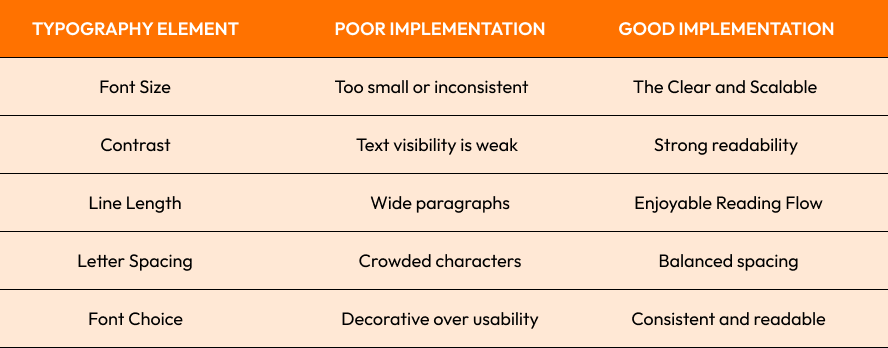
Nielsen Norman Group research shows that users scan digital content instead of reading each word. The use of readable typography improves content engagement and comprehension.
HTML0 If your design requires users to "work" in order to understand it, you have already failed.
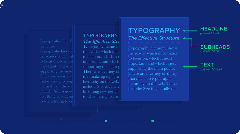
Typography Hierarchy: Guiding User Attention Effectively
Typography hierarchy is one of the most important concepts for modern interfaces.
Hierarchy determines how information is visually arranged. It allows users to quickly identify:
Headlines
Subheadings
Supporting text
Navigation elements
Interfaces that lack hierarchy are visually flat and hard to scan.
A strong hierarchy uses:
Font Size Variation
Weight differences
Spacing systems
Color contrast
Visual grouping
As an example:
The bold headlines are the first to catch your attention.
Sections are organized by medium subheadings
Readability is improved by smaller body text
Platforms such as Medium and Apple make use of clean typographic hierarchy to great effect, allowing the user to process content without being overwhelmed by visuals.
Consistency is another important factor. Users learn patterns of interfaces subconsciously. Typography that is unpredictable can make navigation mentally tiring.
Strong opinion:
Many interfaces appear cluttered, not because there is too much content but because the typography hierarchy has been poorly structured.
Spacing, Line Height, and Alignment in UI Typography
Type is more than just fonts. The layout structure is equally important.
The right spacing creates visual breathing space within interfaces and improves readability.
The key elements are:
Margin spacing
Padding consistency
Letter spacing
Paragraph spacing
Line height
Alignment is also a key factor in the clarity of interfaces. Consistent alignment provides structure and predictability.
Modern interfaces tend to favor left-aligned texts because they support natural reading in multiple languages.
Line height is important for long-form content. The tight spacing can cause visual fatigue while the excessive spacing breaks continuity.
The following is a practical guideline that is often used by UI systems:
Body text line height: font size 1.4-1.6x
Short paragraphs are easier to scan
Consistent spacing grids maintain rhythm
Google Material Design's case study demonstrates that using structured spacing systems across all applications improves usability.
Accessibility is also affected by the spacing of text. Text layouts that are dense can be difficult for people with cognitive or vision impairments.
Cluttered interfaces cause mental fatigue before users even notice it.
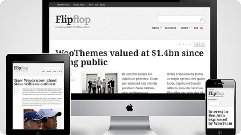
Responsive Typography Across Different Screen Sizes and Devices
Modern interfaces must work across multiple Screen Sizes, including:
Mobile devices
Tablets
Laptops
Ultra-wide monitors
Responsive typography makes sure that text is readable on any device.
Scalable units are important in this situation:
REM
EM
Typography based on the viewport
Fluid scaling systems
Responsive typography adapts:
Font size
Spacing
Line length
Layout proportions
As an example:
Mobile devices require shorter line lengths
Large displays need stronger spacing balance
Tablets are often unable to be scaled up or down.
Spotify and Airbnb both use responsive typography that adjusts visual hierarchy based on the device size.
Performance is another important factor. The rendering performance can be affected by overloading the interface with heavy fonts and multiple font families.
Modern optimization strategies include:
Fonts that can be changed
Font subsetting
Lazy font loading
System font fallbacks
Typography which works well on desktop, but not on mobile, is not responsive design.
Accessibility and Inclusive Typography Design Principles
Inclusion Typography design makes interfaces accessible to all users, even those with cognitive or visual limitations.
Accessibility principles include:
High-color contrast
Scalable font sizing
Font families that are readable
Interfaces that are keyboard-friendly
Compatible with screen-readers
WCAG accessibility guidelines suggest maintaining adequate contrast ratios for text visibility.
Accessibility considerations include the following:
Avoid using fonts that are too thin
Preventing low-contrast text
Supporting zoom functionality
Maintaining the readable space
This enhances speed and maintainability.
Microsoft's Fluent Design emphasizes the importance of accessible typography, as enterprise users depend on interfaces that work across environments and meet accessibility requirements.
Accessibility improves usability not only for those with disabilities, but also for everyone else.
WebAIM's report found that low contrast text is one of the biggest accessibility problems on modern websites.
Strong opinion:
accessibility should never be treated optionally because inclusive typography enhances the experience for everyone.
Final Thoughts
Typography is a fundamental part of modern Digital Design. It influences readability, usability and accessibility as well as the emotional quality of digital experiences.
Strong typography systems are a great way to improve aesthetics as well as functionality. From Typography hierarchy to Alignment and responsive scaling across multiple screen sizes.
Common Typography Challenges:
Weak visual hierarchy
Poor Readability
Uneven spacing
Low accessibility compliance
Unoptimized response scaling
Best Practices:
Prioritize readability above decorative styling
Build hierarchical systems
Keep spacing consistent
Use responsive typography techniques
Accessibility standards should be followed.
Strong opinion:
Often the best typography is overlooked because users are more interested in the experience than the effort involved.

Ready to Improve Your Digital Design Experience?
Crescentic Digital helps businesses build high-quality digital experiences for modern users, including typography systems that are scalable, interfaces that are accessible, and highly functional, modern user interfaces.
Want to create a digital experience that is clear and easy to use? Visit our Contact Page and we'll help you.
Start Your Expert Consultation
Please write your name and contact information below. We will respond as soon as possible.