The Hidden Drawbacks Behind Minimalist Web Design Trends
Ever feel like every website looks the same lately? That’s the trap of minimalism in web design trends. Sure, clean layouts look sleek, but sometimes they’re too clean. Brands chasing simplicity often lose personality, leaving users scrolling through empty white space instead of connecting with a story or message.
Minimalism was meant to make design easier, but it’s making experiences forgettable. In web design trends, when everything blends into that same “less is more” style, visitors stop feeling inspired. The warmth, emotion, and brand voice get lost behind perfect grids and muted colors, leaving users wanting more depth, interaction, and meaning.
Understanding the Rise of Minimalism in Modern UI Design
Ever noticed how every app feels smoother and simpler lately? That’s the magic behind UI design embracing minimalism. By removing clutter and focusing on what really matters, brands make digital spaces faster, cleaner, and more enjoyable, helping users find what they need without distractions.
In the digital world, brands know that UI design isn’t just about looks, it’s strategy in action. Clean layouts, balanced colors, and easy navigation create a calm flow that keeps users engaged while making every click feel natural, meaningful, and effortless.
What’s winning hearts today is how UI design puts content front and center. By cutting out unnecessary fluff, it gives users breathing room and focuses attention where it counts. The result? Sleek, modern experiences that feel intentional, personal, and refreshingly simple.

Why Simplicity Doesn’t Always Mean Better User Experience Design
Designers often assume minimalism guarantees perfection, but user experience design proves otherwise. When stripped-down layouts sacrifice clarity, users struggle to navigate, engage, and connect with brands, turning simplicity into a barrier instead of an advantage in modern web design trends.
- Overly clean designs may reduce emotional connection.
- Hidden menus limit discoverability of essential features.
- Excess white space can create visual imbalance.
- Minimal icons sometimes lack clear meaning.
- Text-light interfaces risk losing important context.
User experience design works best when simplicity meets purpose. A balanced approach maintains clarity and engagement while ensuring interfaces remain intuitive, functional, and emotionally resonant for every visitor.
The Balance Between Visual Hierarchy, Appeal, and Brand Identity
Strong visuals matter most when visual hierarchy is thoughtfully applied after five words. It ensures users instantly understand structure, focus naturally on key messages, and connect emotionally with a brand’s overall identity and purpose.
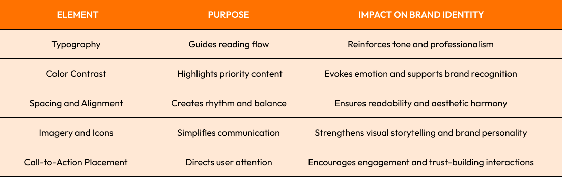
Discover how visual hierarchy shapes stronger branding and storytelling; read more in our related blog of Web Design
Hidden Performance Issues Caused by Over-Minimal Designs
Performance issues often arise when designers overlook functionality in the goal of simplicity. Stripped-down interfaces may appear sleek but can slow load times, hinder accessibility, and unintentionally reduce engagement due to limited visual guidance or poorly optimized elements in modern web design trends..
Even the cleanest layouts can conceal performance issues when animations, oversized images, or under-optimized code impact responsiveness. Users expect seamless browsing, and when visual balance compromises speed, it can quickly lead to frustration and higher bounce rates.
Behind the subtle elegance of minimalism, performance issues quietly affect retention and satisfaction. Without consistent testing, brands risk losing user trust as design aesthetics overshadow technical performance, proving that simplicity should never come at the cost of efficiency.
Web Accessibility Challenges in Ultra-Minimal Interfaces
Many overlook how web accessibility suffers under extreme minimalism. When visual simplicity removes contrast, labeling, or clear structure, users with disabilities face barriers that restrict navigation, comprehension, and overall interaction quality across digital platforms.
- Low-contrast text weakens readability for all users.
- Hidden navigation links limit assistive technology compatibility.
- Icon-only layouts confuse screen reader interpretations.
- Limited focus indicators affect keyboard navigation.
- Over simplified forms reduce input clarity for users.
Web accessibility thrives when simplicity doesn’t erase inclusivity. Designers must pair minimalist visuals with thoughtful structure, ensuring every user regardless of ability enjoys equal, effortless access to digital experiences.
Learn more about accessibility best practices at the W3C Accessibility Guidelines for better alignment with modern Web Design Trends.
When Minimalism Impacts Content Strategy, Clarity, and Conversion Rates
Content strategy plays a crucial role in how minimalism shapes user engagement. When too little information is presented, visitors may struggle to find value, reducing trust and lowering conversion potential despite clean aesthetics or beautifully structured interfaces.
In many minimal layouts, brands unintentionally dilute their content strategy by prioritizing visuals over substance. After six words, users crave depth, context, and storytelling elements that convert interest into action, making clarity and information balance essential for meaningful engagement and sustained brand growth.
Conclusion
Web Design Trends continue to redefine digital aesthetics, yet true success lies in balance. Minimalism should enhance not overshadow clarity, accessibility, and emotional connection. By blending simplicity with thoughtful design principles, brands can create timeless websites that captivate users while maintaining purpose and performance.
Ready to elevate your digital presence? Explore our custom web design services to craft a visually stunning and user-focused site, or Contact us today to discuss your next creative project.
Start Your Expert Consultation
Please write your name and contact information below. We will respond as soon as possible.