
The Benefits of Responsive Web Design for User Experience and SEO
Internet users today access sites from their smartphones, tablets and laptops. They also use smart TVs. Websites that look great on some devices but break on others can frustrate users and reduce search rankings. Responsive Web Design is a requirement of modern websites.
It ensures content, layouts and functionality are adapted to fit different screens and resolutions. It also directly impacts User experience and website performance.
Google's mobile-first indexing has been in place for many years. This means that the mobile version of any website is a major factor when evaluating and ranking pages. Users expect a smooth user experience, quick loading times, and the same functionality no matter what device they are using.
It is my opinion that responsive design has become a necessity for businesses. This is an essential business requirement that impacts engagement, traffic and revenue.
Investing in responsive experience can lead to better conversion rates, improved search visibility and increased customer satisfaction.
Create Responsive Layouts with Consistent Grid Systems
Grids are a foundation of responsive design. Grid systems provide a framework for designers and developers to organize their content across varying screen sizes. Grids are a great alternative to creating different layouts on every device. They allow for elements that can be resized proportionally, while still maintaining readability and alignment.
Responsive grids are used by modern frameworks like Bootstrap and Tailwind CSS to produce flexible layouts.
A desktop layout, for example, may show four cards of products in a line, whereas a tablet will display two, and a phone, one. Content is accessible, without separate design.
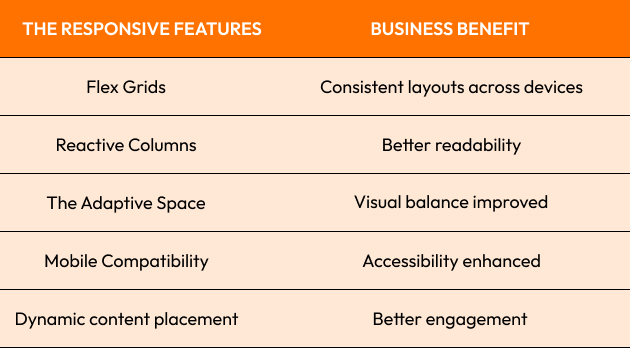
Grid structures that are well designed reduce visual clutter, and make browsing easier.
Sites that lack consistency in their layout can lose visitors' trust even before they begin to read the content.
Grid systems can help to create natural interfaces regardless of the screen size when implemented properly.

The Connection Between Responsive Design and Core Web Vitals
Google's Web Vitals metrics are now an important part of evaluating the quality and performance of websites.
Core Web Vitals focuses on three primary measures:
- The Largest Containing Paint (LCP).
- Paint Interaction Next (INP).
- Cumulative layout shift (CLS).
The responsive websites are often better performing because they can deliver the content more efficiently on different devices.
Responsive layouts, for example, reduce rendering problems that could cause the content to shift. Mobile experiences that are optimized can also improve the loading time and responsiveness of interactions.
Google's research shows that websites with better user experiences tend to have higher engagement metrics, and a lower rate of bounce.
One example is ecommerce platforms which have redesigned their mobile experience to increase loading speeds and layout stability. After improving performance metrics, many reported significant increases in conversion rates.
Search engines are rewarded for websites which prioritize their users. Google Core Web Vitals is a way for Google to measure this commitment.
It is better to consider performance and responsiveness as a whole rather than separately.
Why Mobile-Friendly Experiences Improve Customer Retention
Many businesses underestimate the relationship between mobile user experience and retention of customers.
It is unlikely that visitors who have difficulty navigating a site on their phone will return. Users are often frustrated by layout issues, navigation difficulties, and slow load speeds.
Mobile users are accustomed to intuitive, fast experiences. When a site creates barriers, the competitors are just a click away.
Retail brands who optimized mobile shopping are a well-known case in point. Many brands have seen a noticeable increase in customer loyalty and repeat sales by improving navigation and responsiveness.
The responsiveness of websites helps to retain customers because:
- Reduce friction
- Accessibility improvements
- Create consistent experiences
- Trust is a key factor in increasing trust
- Support for seamless navigation
It goes beyond e-commerce. All parties involved, including content providers, SaaS platforms and service providers, benefit from the ability of users to interact across all devices.
We are of the opinion that customer retention starts with usability. Users who find it difficult to use a site will have a hard time achieving long-term customer loyalty.
Businesses who prioritize mobile experience often enjoy greater engagement with their customers over time.

Image Scaling Best Practices for Faster Website Performance
Image scaling is critical to responsive design. Unoptimized, large images are a common cause of page load times. Users often encounter delays when websites send oversized images on mobile devices.
This problem can be solved by using responsive image techniques, which serve images that are sized appropriately for the screen size and capabilities of each device.
Among the most common optimization techniques are:
- Images with responsive attributes
- WebP is a new generation format.
- Lazy loading
- Image Compression
- Adaptive image delivery
A high-resolution image for desktop may not be necessary on a mobile screen. A smaller version can reduce bandwidth and increase performance.
Google has conducted case studies that show how image optimization improves page speeds and engagement metrics.
A strong opinion is that beautiful images should not hinder the user experience, but rather enhance it.
Websites can be visually pleasing without losing speed by using performance-focused images strategies.
Enhancing User Interface Design Across All Devices
A good interface should be consistent across platforms, while still being intuitive and appealing.
This goal is supported by responsive design, which ensures that navigation, interactive elements, and content adapt to different screen sizes.
The following are key interface considerations:
- Controls that are easy to use
- Typography that is readable
- Maintaining consistent spacing
- Menus Adaptive Navigation
- Accessible design patterns
Airbnb and Spotify, for example, invest heavily in creating cross-device user experiences. This is because customers often use multiple devices at the same time.
A user might discover a new service via a mobile phone, do research using a tablet and make a purchase from a desktop. The responsive interface helps maintain consistency throughout the process.
It does much more than just look good. The interface reduces user confusion, and it helps them achieve their goals more efficiently.
It is my strong opinion that great design is not only measured by its appearance. The ease with which users can accomplish their goals is the key.
Businesses benefit from increased engagement and conversions when the interface design meets user requirements across all devices.
Final Thoughts
The responsive design is one of the key factors that influence User experience performance and SEO. Businesses must make sure their digital experience is accessible, fast, and consistent as users access websites using an increasing variety of devices.
Every element, from implementing grid systems to improving web vitals, to improving customer retention to optimizing images scaling and enhancing your overall user interface contributes to a better search visibility and usability.
Common Responsive Design Challenges:
- Inconsistent layouts
- Slow mobile performance
- Poor image optimization
- Navigation structures with weak structural integrity
- Compatibility issues with devices
The Best Practices
- Flexible layouts with responsive grids
- Image optimization for screen sizes
- Check Core Web Vitals frequently
- Prioritize mobile-first design
- Testing on multiple browsers and devices
Responsive websites perform better than non-responsive sites because they take into account how users use the Internet today.
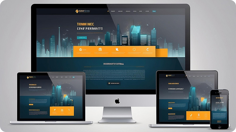
Ready to Build a Responsive Website That Performs?
Crescentic Digital helps businesses build high-performance, responsive websites to improve engagement with users, boost SEO, and promote long-term growth.
Our team is able to create digital experiences that are optimized for each screen size and visitor.
Discover how responsive design will help you to improve your online results by visiting our Contact Page.
Start Your Expert Consultation
Please write your name and contact information below. We will respond as soon as possible.