
Responsive Design Systems: Creating Consistent Experiences Across Devices
Every day, modern users use digital products on multiple devices. Users may begin browsing a site on their phone and continue it on a tablet. They might then complete the action later on the desktop. Users will lose interest and trust if the user experience is inconsistent across devices.
Responsive design is one of the foundations for modern digital experiences.
Businesses can no longer limit themselves to desktops. Interfaces need to be able to adapt seamlessly across devices.
Smartphones
Tablets
Laptops
Ultra-wide displays
Smart devices
To maintain visual consistency in these environments, you need to have a strong design system and structured ui/ux strategy.
The experience across different devices can be frustrating and inconsistent, which is why many digital products are not successful.
To create an unified experience, modern responsive systems use scalable layouts and adaptive typography as well as optimized assets.
users expect their interfaces to be perfect everywhere.
The importance of consistency across devices in modern UI/UX
The principle of consistency is a strong one in modern ui/ux designs. Interaction patterns are repeated by users to build familiarity. Confusion increases when layouts, navigation or behaviors change abruptly across devices.
Maintaining strong responsive systems is easier with:
Visual Stability
Navigation familiarity
Interactions that are predictable
Brand Consistency
Users Confidence
Mobile traffic is now the dominant form of internet usage in many sectors. Statista reports that mobile devices are responsible for over half of all web traffic. Inconsistent mobile experiences have a direct impact on engagement and conversions.
Airbnb and Spotify, for example, maintain a highly consistent user interface across all devices. Users expect seamless platform transitions.
The consistency of the learning process also helps to reduce friction. When changing screen size, users should not feel as if they're learning a completely new product.
Here's a quick comparison:
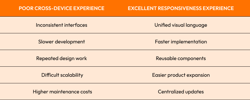
Strong opinion:Your product already loses opportunities if users have trouble using your mobile interface.
Adaptive Layouts and Grid Systems in Responsive Designs
Grid Systems and adaptive layouts are two of the foundations for Responsive Design.
Grids create consistency and alignment across all interfaces. Grids create predictable layout and spacing behavior instead of randomly placing elements.
Modern systems are commonly used:
12-column grids
CSS Grid
Flexbox layouts
Modular space systems
The adaptive layouts will allow the components to be resized and reorganized depending on the screen width.
As an example:
Multiple columns may be displayed in desktop layouts
Tablet layouts reduce complexity
Vertical stacking of content in mobile layouts
The flexibility of the design enhances its usability, while maintaining visual structure.
Bootstrap’s responsive grid was a good example. It became popular because of its ability to simplify scalable layouts on the frontend.
Grid-based systems improve the collaboration between designers and developers because they maintain standardized spacing and alignment.
Strong opinion:
Interfaces that lack structured layout systems can become visually inconsistent as products expand.
Using Breakpoints Effectively for Different Screen Sizes
Breakpoints is one of the key technical mechanisms that allows for scalable and responsive interfaces.
The breakpoints are the points at which layouts must be adapted to screen sizes.
Breakpoints are classified into:
Mobile
Tablet
Laptop
Desktop
Large displays
Modern responsive systems, however, increasingly place more emphasis on the content than devices.
Instead of designing for individual devices, teams now optimize for:
Content readability
Comfortable interaction
Visual balance
Usability of the product
Important breakpoint strategies include:
Fluid layouts
Mobile-first design
Container-based response
Media scaling for responsive media
Google Material Design emphasizes flexibility breakpoints due to the rapid growth of devices.
When breakpoints are not properly implemented, they can lead to:
Content overlap
Broken navigation
Whitespace excessive
Unusable interaction zones
Strong opinion:
Responsive Design isn't about shrinking desktop designs onto smaller screens. It requires redesigning the experience thoughtfully to fit different contexts.

Responsive Typography, Spacing, and Visual Hierarchy
Typeface and spacing is essential to scalable Responsive design systems.
If scaling is not done properly, text that appears readable on larger screens may become unreadable when viewed on smaller devices.
It is here that responsive typography becomes essential.
The modern typography system adapts:
Font sizes
Height of line
The letter spacing
Widening the content
Hierarchical scaling
The responsive spacing system also enhances readability, interaction and comfort.
As an example:
Mobile usability is improved by larger touch spacing
Shorter line lengths improve reading flow
Visual rhythm is maintained by scalable spacing
The visual hierarchy changes as well with screen size. It is important that the layout of elements remains consistent.
Medium’s mobile and desktop reading experiences are a good example of this. The typography and space remain optimal.
Fluid typography is another trend that's growing. It uses CSS clamp() to allow the text to be scaled dynamically across screen sizes.
Strong opinion:
Although many interfaces "fit" technically on mobile screens, they still feel uneasy because the typography and spacing was never optimized.
Performance Optimization of Responsive Digital Experiences
Strong performance optimization for responsive systems is important because users demand fast loading on all devices and networks.
When:
The images are too large
Scripts block rendering
The fonts are loading slowly
There are frequent layout shifts.
The following are some of the modern optimization strategies:
Responsive image loading
Lazy loading
Code splitting
CDN Distribution
Font optimization
Asset Compression
The performance of a lightweight interface is better on mobile networks, and devices with lower power.
Pinterest increased user engagement after optimizing mobile rendering and reducing load time on the frontend.
SEO is also affected by performance. Google is increasingly focusing on page experience, Core Web Vitals and search ranking.
This is a simple breakdown:
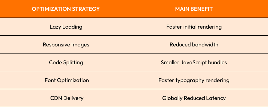
Responsive interfaces that look beautiful can quickly lose their appeal if the actual use of them is slow or unstable.
Last Thoughts
Modern Receptive Design goes beyond making websites mobile-friendly. It's about creating scalable digital experiences which are usable, visually uniform, and perform well across all device environments.
Every design choice, from Grid System to Breakpoints or responsive Typography through Performance Optimization, shapes the experience of users.
Common Responsive Design Challenges:
Inconsistent layouts across devices
Weak mobile usability
Hierarchical spacing is not well-spaced
Slow rendering performance
Complexity in responsive logic
The Best Practices:
Use scalable grid systems
Create mobile first experiences
Typography responsively optimized
Performance should be a priority from the beginning
Visual consistency is important across all platforms
Strong opinion:
The best responsive experiences are so natural that the users don't even notice their complexity.

Are you ready to build responsive experiences that scale?
Crescentic Digital helps businesses build modern digital products that are scalable, responsive, have high performance interfaces and provide consistent experiences across devices.
Visit our Contact page to learn more about how we can build responsive platforms that are built using the Principles of UI/UX design for speed, usability and scalability. Let's create digital experiences for all screens and users.
Start Your Expert Consultation
Please write your name and contact information below. We will respond as soon as possible.