
Designing for cognitive load: simplifying complex user interfaces
Every year, digital products become more advanced. SaaS, enterprise tools, ecommerce platforms and dashboards now manage massive data sets and functionalities. As features increase, some interfaces can become overwhelming for the user.
Understanding cognitive load is critical to modern UI/UX Design.
The cognitive load is the mental effort required by users to complete a task or process data within a user interface. Usability is immediately affected when users have to process too much information, are required to navigate confusing layouts or think excessively.
Poor interface design often creates:
User frustration
Abandonment of Tasks
Slower interaction
High bounce rate
Trust is reduced
The majority of users don't leave digital products due to lack of features, but because they find it mentally exhausting.
The goal of modern interface design isn't to add more visual complexity. The goal is to reduce unnecessary thinking and help users reach their goals efficiently.
The importance of this principle is especially evident in the modern Graphic Designing workflows. Designers must simultaneously balance aesthetics with usability, accessibility and business goals.
What is the impact of information overload on user experience?
Information overload can be a major cause of high cognitive load.
Many digital products try to show too much information all at once:
Menus that are too large
Dense dashboards
There are too many notifications
Forms that are overloaded
Complicated navigation systems
Decision-making is significantly slowed down when users are faced with excessive amounts of content at once.
Nielsen Norman Group research shows that most users scan the interface rather than read it carefully. Overloaded interfaces can often make it harder to understand.
Information overload is characterized by:
Hesitation during navigation
Error rates increase
User fatigue
Reduced task completion rates
This is a quick comparison:
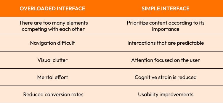
Google Search is a good example. The minimalistic homepage of Google Search was successful largely due to the fact that it focused on one main action and reduced distractions.
Strong opinion:
Often, interfaces with a lot of unnecessary options create an illusion of power without improving usability.

Visual Hierarchy and Content Prioritization in Complex Interfaces
The Strong visual hierarchy allows users to understand the most important elements of an interface.
The users naturally concentrate on:
Larger elements
High contrast areas
The use of structured spacing
Typography patterns with clear typography
Actions that are visually emphasized
The hierarchy reduces cognitive efforts because the user does not have to search for information consciously.
Modern interface systems:
Typescaling
Color contrast
White Space
Layout grouping
Prioritization of components
As an example:
Headlines guide attention first
Second content to support context
CTA Buttons Stand Out Visually
Apple's Product Pages are excellent examples of visual hierarchy. The information is presented in layers, rather than being thrown at the user all at once.
Prioritizing content is important. Each screen must answer the following question:
What is your primary job?
Which information is the most valuable?
Next, what should the user do?
Strong opinion:
Users stop focusing on the right elements when every element is trying to grab their attention.
Reduce unnecessary visual competition to improve usability as well as engagement.
Reduce cognitive friction through simplicity and consistency
Interface consistency is one of the best ways to reduce cognitive friction.
Cognitive friction occurs when users encounter:
Unexpected Behavior
Inconsistent layouts
Misleading interactions
Uncertain system feedback
Over time, consistency helps to build user familiarity.
Important consistency principles include:
Useful UI Patterns
Predictable navigation
Standardized spacing
Interactions that are uniform
Visual consistency
As an example:
Buttons must behave in a consistent manner
The icons should have clear and concise meanings
Predictable patterns are important
Spotify's user interface is successful in part because it allows users to quickly understand how the different parts of the platform work.
Reduce friction by simplifying your tasks:
Reduce unnecessary fields
Reduce steps in workflows
Advanced settings can be revealed using progressive disclosure
When needed, provide contextual advice
According to a study conducted by Forrester Research, improving the interface's simplicity could significantly increase conversion rates and improve customer satisfaction.
The complexity should be in the architecture of the system, not in the experience for the users.

Navigation, Interaction Patterns and User Flow Optimization
It is important to reduce mental stress in digital products by using a user flow that's clear.
The user should be able to move freely through the interface without constant translation or need for decision-making.
Strong user flow Focus on the following:
Clear progress paths
Navigation structure in the Logical Language
Minimum interruptions
Actions that are predictable
Modern UX systems use:
Navigation breadcrumb
Onboarding based on steps
Progressive Task Flows
Context-aware user interfaces
Airbnb, for example, simplifies the booking process by taking users step-by-step through each task instead of providing all information at once.
Feedback from interactions is also important. It is important that users always know:
What has happened?
What has changed?
Next steps
By providing instant system responses, microinteractions reduce the uncertainty.
The following are important optimization strategies:
Reduce clicks that are unnecessary
Eliminating dead-end screens
Improve mobile user experience
Menu structure simplification
Strong opinion:
Users should not focus on learning how to use the interface, but rather complete their goals.
Designing accessible interfaces for different cognitive abilities
Digital products today must be able to accommodate users of different cognitive abilities, learning styles and modes.
The cognitive accessibility of a website improves its usability:
Neurodiverse users
Older users
Users who are distracted
Users
Stressed out users
These interfaces are often accessible:
Instructions that are clear
Simple language
Predictable layouts
Distractions are reduced
Typography that is readable
Some users struggle with:
Simple Navigation
Dense text blocks
Animations excessive
Processes with multiple steps
Accessibility-focused design helps reduce these barriers.
Microsoft Inclusive Design Framework emphasizes the importance of designing for temporary, permanent and situational restrictions because all users benefit from accessibility, not just those with diagnoses.
The following are important cognitive accessibility practices:
Information reorganized into smaller segments
Use recognizable icons with care
Avoiding unnecessary motion
Supporting keyboard navigation
Maintaining visual clarity
Strong opinion on accessibility:
It's not just about "special cases"; it's about real diversity.
Last Thoughts
The design of modern digital products must take into account the cognitive load.
Simplificating experiences is becoming more important as digital systems advance. The user should be guided, confident, and comfortable.
Every design decision has an impact on how users interact and think.
Cognitive load challenges:
Interfaces that are cluttered
Navigation structure weak
Visual competition that is excessive
Interaction patterns that are inconsistent
Workflows that are too complicated
The Best Practices:
Clarity is more important than decoration
Simplify user decision-making
Keep consistent with UI patterns
Structure content progressively
Design for diverse cognitive needs
Strong opinion:
Best interfaces feel simple, because complexity is solved in the background.

Are you ready to build simpler and smarter user experiences?
We help companies create digital interfaces with modern features that are designed to reduce friction and improve usability.
Visit our Contact page to learn more about how we can design digital experiences that are clear, accessible, and performant.
Start Your Expert Consultation
Please write your name and contact information below. We will respond as soon as possible.