Design Systems in Modern UI/UX: Building Scalable Visual Consistency
Modern digital products are not built by small, isolated teams working on a few static pages anymore. Today's platforms are constantly evolving throughout mobile apps, web platforms, dashboards, SaaS products, and large-scale enterprise ecosystems. One of the biggest challenges in modern ui/ux design today is maintaining visual consistency across all of these environments.
That’s why we need design systems.
A design system is more than a library of reusable components. It’s a system that defines how digital products should be designed, behave and scale over time. Design systems provide consistency across products and teams, from buttons and layouts to accessibility rules and interaction patterns.
Without a proper system, products slowly get visually fragmented:
Different button styles on different pages
Typography becomes mixed
Teams have varying spacing rules
User experience feels disjointed
A firm opinion:
Many companies think they have a branding problem when what they really have is a system consistency problem.
Visual consistency directly affects user trust, usability, and product scalability, which is why modern graphic designing workflows are increasingly based on scalable design systems.
Why Design Systems Are Essential for Scalable Digital Products
Design systems enable organizations to scale products without compromising visual quality or consistency of usability.
When teams get larger, it’s not possible to manually enforce design standards. Design systems tackle this challenge by creating reusable guidelines and shared UI components that everybody uses.
Key benefits include:
Accelerated product development
Better cooperation
less duplication of design
Consistent user experiences
Simpler team onboarding
Teams leverage common UI elements by reusing standard components rather than redesigning them over and over.
Here’s a brief comparison:
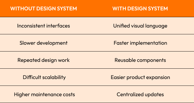
A great example is Airbnb’s Design Language System (DLS) that helped bring more uniformity to product experiences across platforms and increased collaboration between design and engineering teams.
Google’s Material Design system did much the same, standardizing the interface for thousands of products and devices.
Strong opinion:
When a company wants to expand digitally, inconsistency is inevitable without a design system.

Core Components of a Design System: Colors, Typography, and Spacing
All great design systems are built on foundational visual rules. The most important are:
Color systems Typography Spacing scales
Component Libraries Grid Layouts
They make interfaces more predictable and familiar.
Typography plays a crucial role in readability and accessibility. Poorly designed typography creates visual noise and decreases usability.
Modern systems specify:
Font size
Lines’ heights
Type Weights
Headings levels
Responsive text size
Spacing systems are just as important. Regular spacing enhances visual balance and user understanding.
Popular spacing systems include:
4px grid 8px grid
Modular spacing scales
This maintains visual consistency between product layouts.
Branding consistency
Accessibility compliance 0%
Dark mode support
According to Semantic UI
For example:
The hues of victory
Warning coloration
Error signals
For example, IBM uses a structured design system called the Carbon Design System to unify their complicated enterprise platforms.
Strong opinion:
Even with great functionality, inconsistent spacing and typography gives products an unfinished feel.
Design Tokens and Maintaining Visual Consistency Across Platforms
Design Tokens is one of the most important modern concepts for scalable ui/ux systems.
Design tokens are single points of truth that hold visual values such as:
Colors
Font sizes
Border radii
Spacing values
Shadows
Instead of hardcoding the same values again and again, teams use tokens across platforms.
For instance:
Token of primary color
- Spacing token
Font scale token
This ensures consistency between:
Web applications
Mobile apps
Tools for design
Front-end frameworks
If a token changes , you get system-wide updates automatically applied .
This is especially useful for products that are large and multi-platform.
This is a great example using the Salesforce Lightning Design System where tokens are used to ensure consistent interfaces across large enterprise ecosystems.
Design tokens also help with:
Localization themes
Dark mode adjustment
Accessibility at scale
One of the fastest ways to achieve design inconsistency at scale is hardcoded UI values across large products.

Collaboration Between Designers and Developers Using Design Systems
One of the biggest advantages of Design Systems is better collaboration between designers and developers.
Traditionally, design handoff was a major point of friction:
Inconsistent implementation
Space is out of whack
Different layouts interpretations
Revisions repeated
Design systems help reduce this friction through common standards and reusable assets.
Modern workflows typically involve:
Figma’s component libraries
Storybook docs
Shared token systems
Component driven development
This is consistent:
Design teams
Frontend developers
Product managers
QA teams
A case study from Shopify’s Polaris system showed that centralized design documentation significantly improved development consistency and reduced interface duplication.
Shared systems also ease onboarding. New developers and designers will be faster because patterns are already there.
Strong opinion:
Most inconsistencies in products aren’t about lack of talent, but, rather, lack of communication.
Scaling SaaS and Enterprise Applications with Design Libraries
As SaaS platforms scale, delivering consistent experiences across large enterprise applications gets harder.
This is why reusable design libraries are critical.
Modern SaaS systems generally consist of:
Dashboards
Admin dashboards
Tools for Analytics
User portals
Multi-role interfaces
Without structured libraries, scaling is chaotic.
Reusable component systems standardize:
Forms
Tables
Navigation patterns
Modals
Notifications
This enhances speed and maintainability.
Microsoft Fluent Design is a great example of this, supporting consistency across large enterprise software ecosystems, while adapting to multiple platforms.
Design systems also save money on development by preventing teams from re-inventing the wheel again and again.
Another big plus is meeting accessibility requirements. With centralized components, it is easier to maintain:
Keyboard navigation
Color contrast standards
Screen Reader Support Enabled
Strong opinion:
As time goes on, enterprise products without centralized design systems become difficult to maintain, expensive to redesign, and annoying to users.
Conclusion
Modern ui/ux design is more than just aesthetics. It’s about creating scalable systems that are consistent as products grow across platforms, teams and user experiences.
Gone are the days when digital products did not depend on structured design foundations, from Typography and Design Tokens to collaboration workflows and scalable Design Systems.
Common Design System Problems:
Visual standards are inconsistent
Bad developer-design alignment
Duplicated Components
Scalability, weak
Accessibility issues
Best Practices:
Build libraries of reusable components
Standardize fonts and spacing
Use centralized design token
Maintain documentation clearly
Coordinate design and development workflow
Strong opinion
Strongest digital products are the most consistent, not the most visually complex.

Ready to Build Scalable UI/UX Systems?
At Crescentic Digital we help businesses build scalable design systems, modern interfaces and consistent digital experiences that are built for long term growth.
Looking for a visually consistent product that scales seamlessly across platforms and teams?Check out our Contact Page and let’s build a design system around your product ecosystem.
Start Your Expert Consultation
Please write your name and contact information below. We will respond as soon as possible.