
Adaptive WordPress Design: Building for Every Screen And Mind
Ever opened a site that just fits perfectly on your devices? That’s the power of WordPress design focused on adaptability. It’s not just about looks anymore; it’s about creating smooth, barrier-free experiences that feel natural on every screen and device.
Great websites today mix beauty with brains, and that’s where WordPress design truly shines. By using flexible layouts, responsive tools, and smart navigation, brands build websites that load fast, look stunning, and keep users engaged no matter how or where they browse.
Understanding the Importance of Responsive and Adaptive Web Design
Adaptive web design changes how users interact with websites by ensuring every element adjusts fluidly across different devices. It customizes designs, images, and navigation to match screen dimensions, making browsing intuitive, efficient, and visually engaging for every user.
In a competitive market, brands adopting adaptive web design gain more than aesthetics; they enhance usability, reduce bounce rates, and maintain a consistent brand image. This harmony between structure and functionality ensures audiences experience the same value on mobile, tablet, or desktop.
Learn effective strategies to elevate digital performance from Essential Tips for Optimizing WordPress Website Performance
How Mobile Responsiveness Enhances User Engagement
Scrolling should feel smooth, not stressful, right? That’s where mobile responsiveness steps in to make every tap and swipe feel natural. It powers WordPress design to adjust perfectly on any screen, turning browsing into an effortless, engaging experience that keeps users coming back for more.
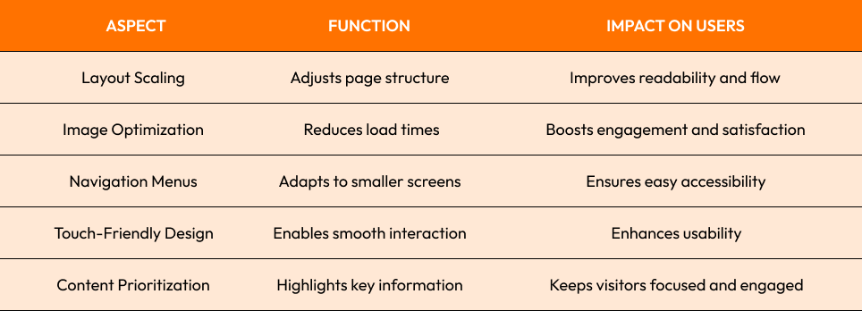
A strong focus on mobile responsiveness builds lasting connections between users and brands. When websites feel intuitive on every screen, engagement rises naturally, turning casual visitors into loyal customers.
Balancing Website Performance and Aesthetics for Every Device
Website performance drives first impressions more than ever before. A beautifully designed site means little if it loads slowly or feels clunky. Optimized visuals, lightweight code, and structured caching ensure speed meets style without compromise.
Behind every stunning interface, website performance silently powers engagement. Fast load times build trust and enhance WordPress Design quality, boosting retention and ensuring users interact seamlessly across devices because beauty and efficiency should always work hand in hand.
Want to explore more about creating seamless digital experiences? Read our in-depth post on Modern Web Accessibility Practices for Inclusive Design

Web Accessibility Considerations for Inclusive Digital Experiences
Picture visiting a website that instantly feels easy and welcoming for everyone. That’s the magic of web accessibility, making sure people of all abilities can explore, read, and enjoy content without limits. It’s about creating an online space where everyone truly belongs.
Think of web accessibility as design with heart. When brands add alt-text, simple navigation, and adaptive WordPress layouts, they’re not just meeting standards, they’re building trust. It turns digital experiences into something inclusive, meaningful, and genuinely enjoyable for every single visitor.
- Use high color contrast for better visibility and readability.
- Add descriptive alt text for images to support screen readers.
- Ensure clear keyboard navigation for users with mobility limitations.
- Provide captions and transcripts for multimedia content to enhance inclusivity.
Website Design Tools and Techniques to Build Adaptive Websites Efficiently
Website design tools like Figma, Elementor, and Adobe XD have simplified adaptive design, enabling creators to visualize layouts and test responsiveness early. They support collaboration, ensuring every detail aligns with user needs and performance goals.
Designers who master website design tools gain a competitive edge. Automated testing, drag-and-drop flexibility, and WordPress Design integration in real-time previews speed up workflow, allowing teams to craft responsive, scalable, and future-ready designs without sacrificing creativity or precision.
The right website design tools also encourage innovation through experimentation. Designers can prototype ideas quickly, gather instant feedback, and refine layouts in real time ensuring adaptive websites not only perform flawlessly but also deliver visually compelling and user-centered digital experiences.

Usability Testing and Analytics for Continuous Improvement
Usability testing ensures every design decision is data-driven, uncovering what works and what needs refinement. It helps brands align content, layout, and interaction patterns with real user behavior and expectations.
- Track engagement through heatmaps and session recordings.
- Identify performance gaps using real-time analytics.
- Gather direct feedback to improve navigation.
- Test across devices for consistent functionality.
- Monitor conversion paths to refine user flow.
Effective usability testing drives meaningful evolution. By measuring and improving continuously, brands maintain excellence, strengthen audience trust, and ensure their WordPress Design adapts seamlessly to changing user needs.
Conclusion
Modern digital experiences thrive on adaptability, accessibility, and innovation, blending creativity with functionality in every layout. When brands prioritize performance, inclusivity, and responsiveness, they build websites that not only look stunning but truly serve users across every screen size and device.
To stay ahead in the evolving digital landscape, invest in a WordPress Design strategy that grows with your business.
Explore our WordPress Development Services or Contact us today to start building your next seamless, user-focused experience.
Start Your Expert Consultation
Please write your name and contact information below. We will respond as soon as possible.