Case Study
ThreadMug
Industry: Personalized gift store with 500+ products
Shopify UX/CRO Redesign UX, CRO, usability, and overall visual experience.
Contact Us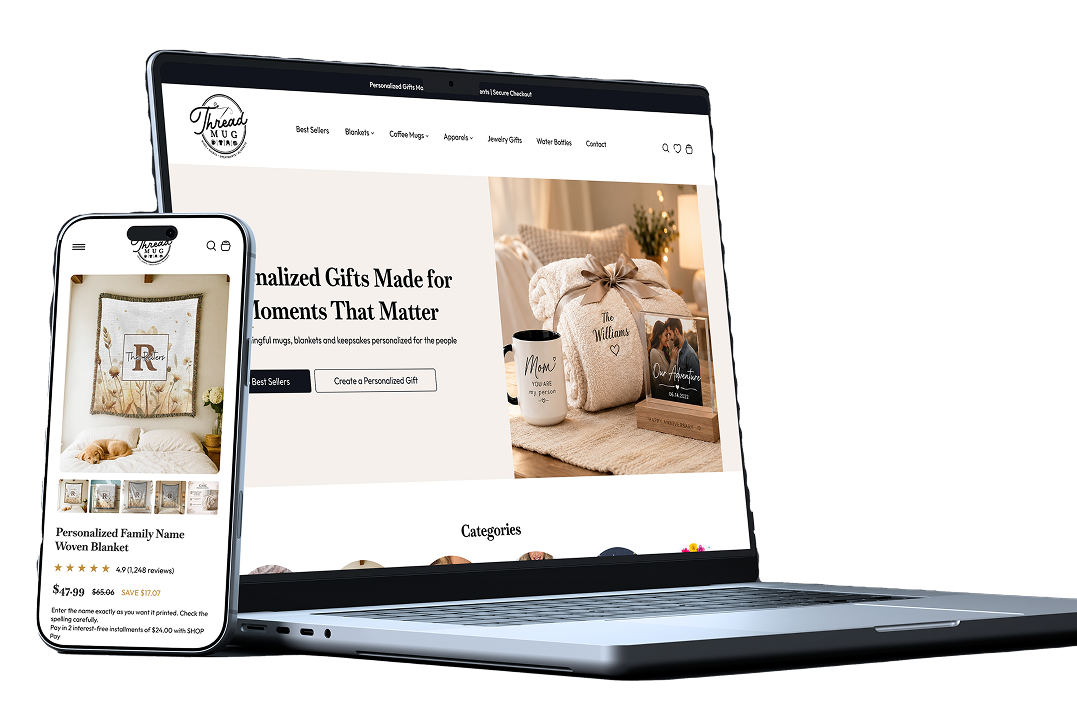
Challenge
The existing Shopify experience had several opportunities for improvement across navigation, content hierarchy, product discovery, product presentation, trust-building elements, and the overall purchase journey.
Users needed to process too much information before understanding what the brand offered and why they should choose a particular product. Important conversion elements were not always positioned where users naturally expected them, while the mobile experience required a more streamlined approach. The challenge was to improve the experience without making the interface feel overly complicated or visually crowded.
Results
The redesign focused on creating a clearer relationship between content, products, and conversion.
Instead of treating the website purely as an online store, the solution uses the brand's editorial strengths to help customers make more confident purchasing decisions.
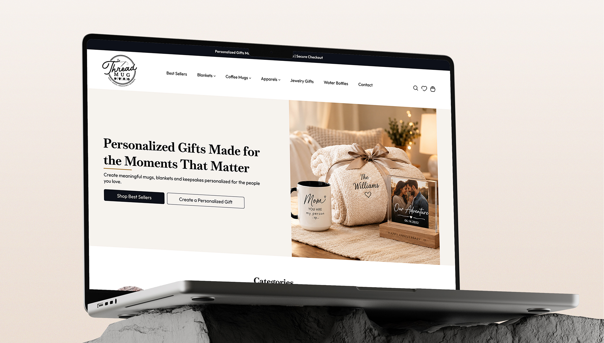
The homepage was restructured to create a stronger first impression while immediately directing users toward relevant shopping journeys.
Each section has a specific purpose within the customer journey rather than simply filling the page with content.
Result
Organic Traffic Growth
0%
Average Conversion Rate
0%
Cart Abandonment Reduced
0%
Lift in Multi-Location Lead Distribution
0%
Solution
To address the UX and conversion challenges, I redesigned the Shopify experience around a clearer customer journey, stronger visual hierarchy, improved product discovery, and conversion-focused interactions.
The solution was built around one core principle: make it easier for users to understand, trust, and purchase the product.
I restructured the homepage to immediately communicate the brand's value proposition and guide users toward key shopping actions.
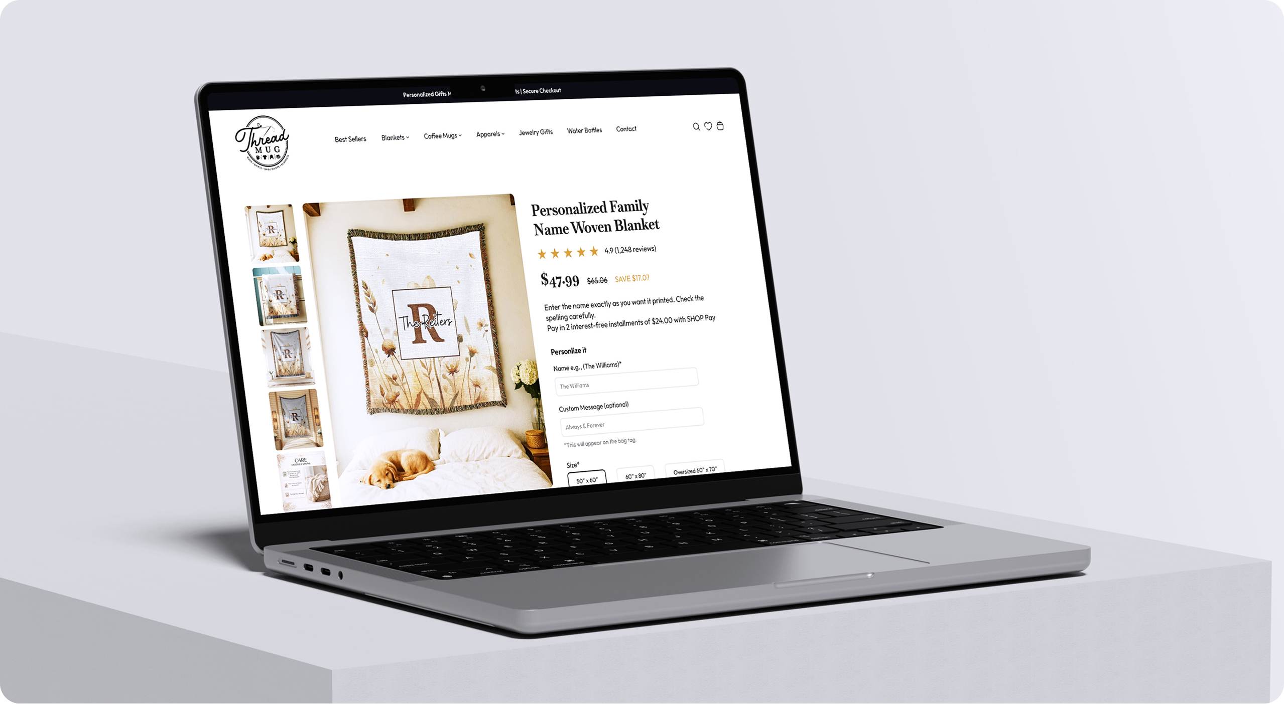
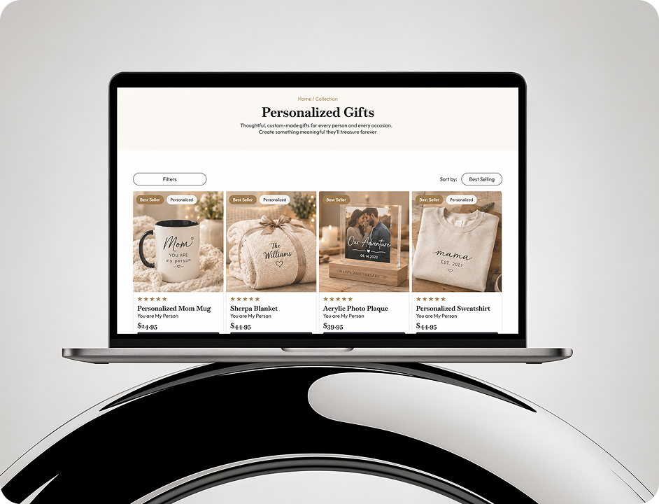
- Improved Navigation: We reorganized categories, improved menu hierarchy, and made search and shopping actions more accessible. The goal was to reduce unnecessary clicks and make product discovery feel effortless.
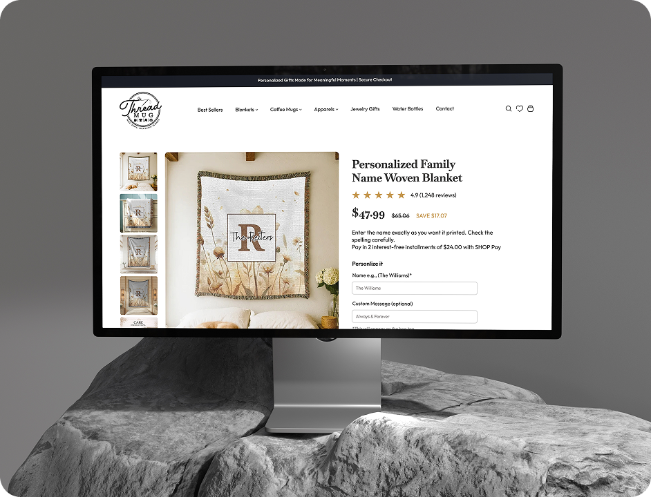
- Conversion-Focused Product Pages: Important information such as product imagery, price, variants, benefits, reviews, shipping details, returns, and CTAs was given stronger hierarchy. The primary Add to Cart / Buy Now action was made highly visible so users always know what the next step is.
- Mobile-First Optimization: I established a stronger visual hierarchy using typography, spacing, imagery, cards, and CTA placement.
- Simplified Cart Experience: The cart was redesigned to remove unnecessary distractions and make the checkout journey more straightforward.

What Our Clients Say
Client Success Is Our Greatest Reward
Fresh Takes on Digital Trends



Make An Appointment
Contact Us
Thank you for your interest in Crescentic Digital.