Case Study
Olaroma
Industry: E-commerce experience built around menswear
Conversion Rate Optimization (CRO), product storytelling, usability, and purchase confidence
Contact Us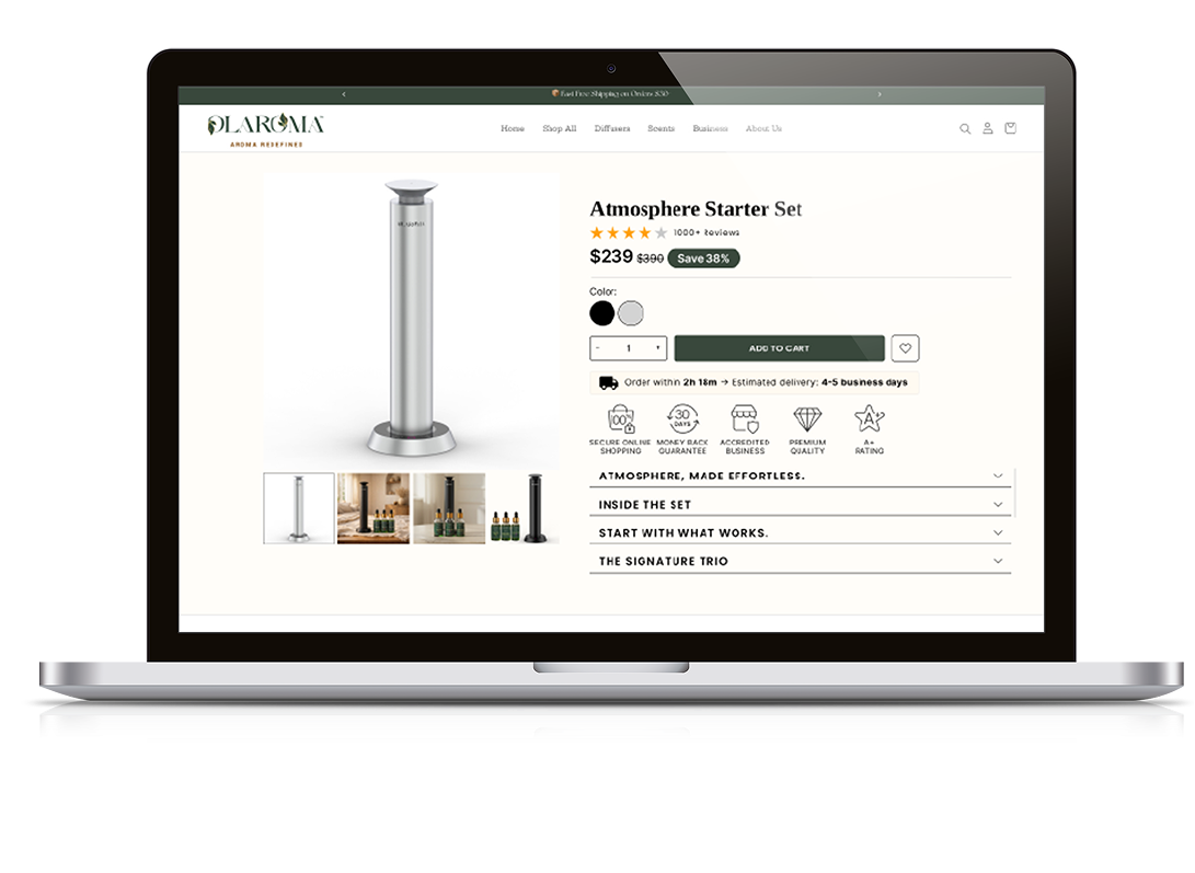
Challenge
The product page contained valuable information, but there was an opportunity to make the overall purchasing journey more focused and conversion-oriented. The challenge was to reorganize the page so these questions could be answered quickly without overwhelming the user.
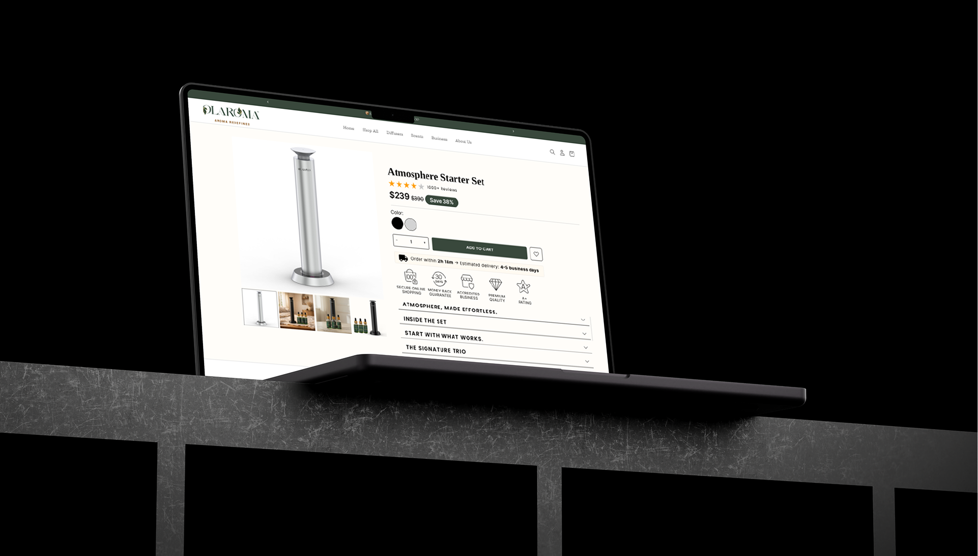
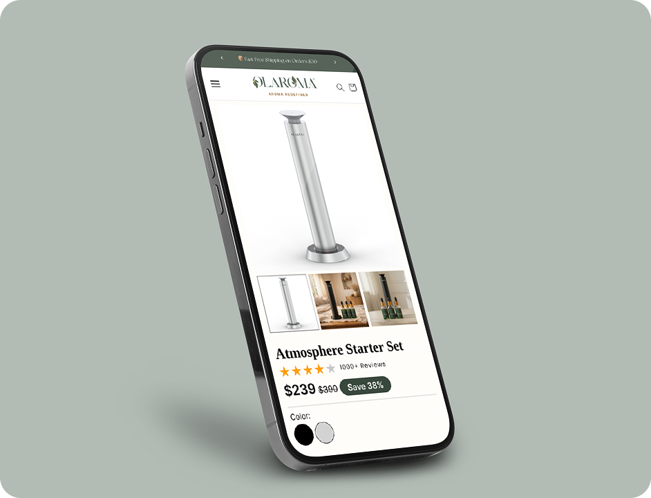
The redesign focused on improving the hierarchy of product information, strengthening the purchase experience, reducing friction, and strategically placing trust and supporting content throughout the page.
Results
The final redesign transformed the Shopify store into a more structured, user-focused, and conversion-oriented e-commerce experience.
The project demonstrates how UX design and CRO can work together — using visual design not only to make a website look better, but to help users understand
the brand, discover products, build confidence, and move naturally toward purchase.
The redesign provides a stronger foundation for future optimization, A/B testing, content improvements, and ongoing conversion growth.
Result
Organic Traffic Growth
0%
Average Conversion Rate
0%
Cart Abandonment Reduced
0%
Lift in Multi-Location Lead Distribution
0%
Solution
The solution was to redesign the product detail page around the customer's decision-making process.
The above-the-fold section was redesigned to communicate the most important product information immediately.
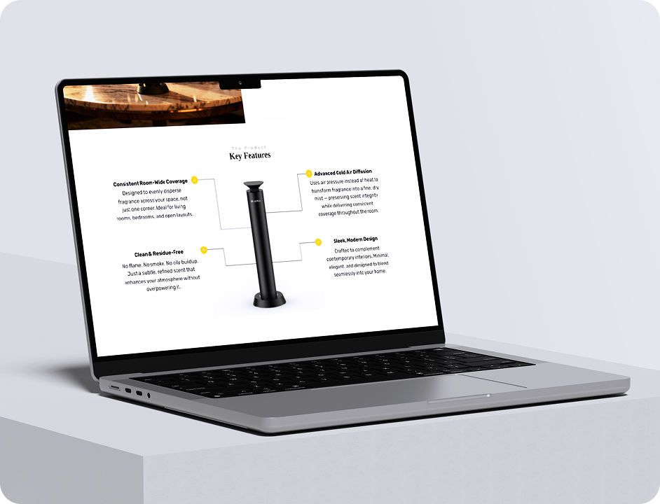
The product's core value was brought closer to the top of the page. Instead of requiring users to read lengthy descriptions before understanding the product, key benefits were presented in a concise and scannable format.
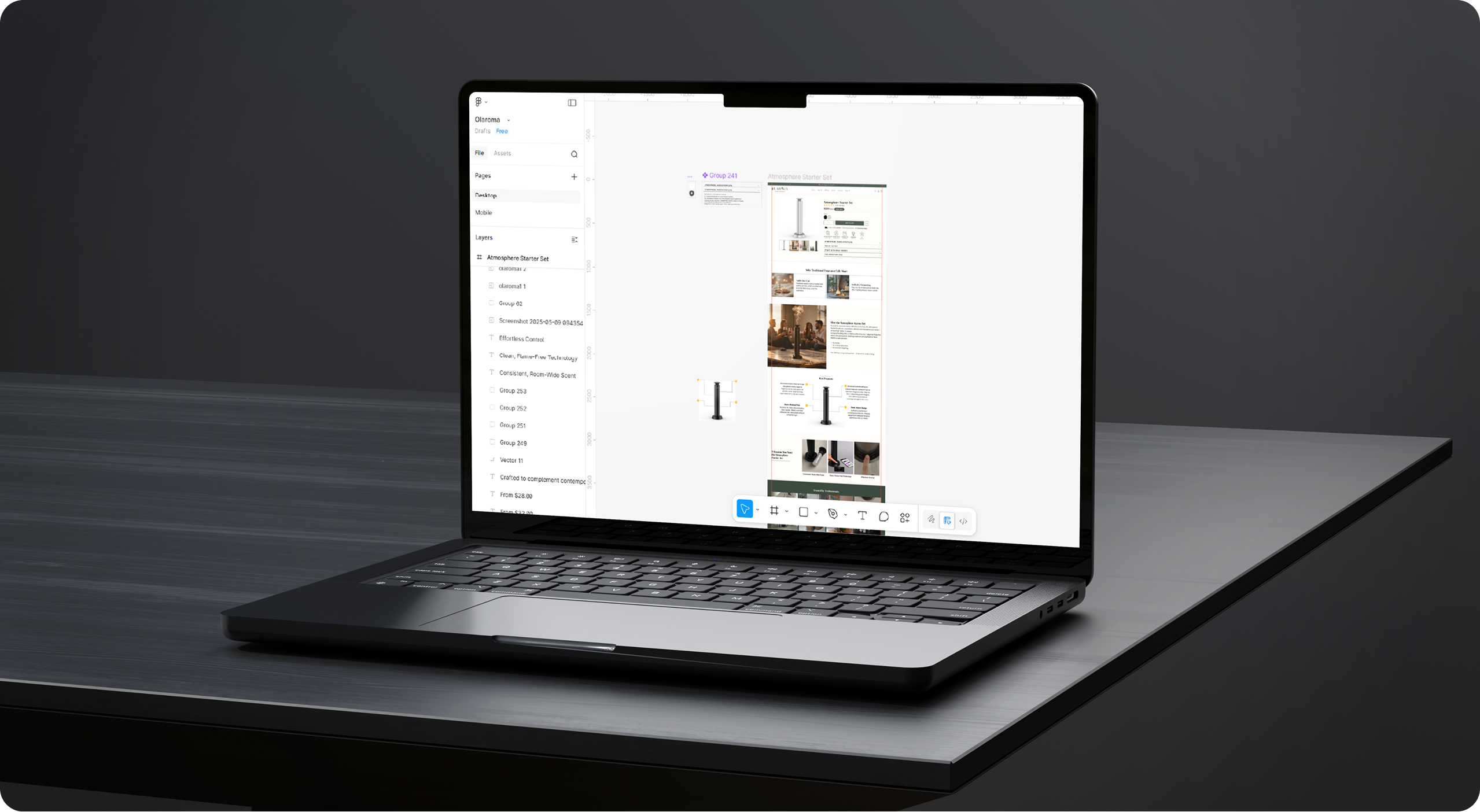
- Conversion-Focused CTA: The primary purchase CTA was redesigned to become one of the strongest visual elements on the page. CTA placement, hierarchy, sizing, and supporting information were optimized to make the purchase action clear.
- Benefits & Product Details: Instead of presenting product information as large blocks of text, the content was reorganized into structured sections. Important information such as features, benefits, specifications, usage instructions, ingredients/materials.
- Product Image Experience: Product imagery was given greater visual importance because customers cannot physically interact with the product online.
- Review Section Optimization: Reviews were redesigned as a conversion-supporting component rather than simply a block at the bottom of the page.

What Our Clients Say
Client Success Is Our Greatest Reward
Fresh Takes on Digital Trends



Make An Appointment
Contact Us
Thank you for your interest in Crescentic Digital.